I think interpreting this info, even if it's correct, takes more than meets the eye. First of all, I took this report as supporting illegal immigration, my bad. It includes both legals and illegals, which begs the question how do they know how many illegals are here or there economic characteristics, when they are undocumented? I have an experience based bias that I believe skews the numbers in favor of the immigrants. In my high-tech job, there were a lot of immigrant engineers who often remained for a few years then went back to their home country. With relatively high paying jobs, they paid a lot of income and social security taxes, didn't have any kids to go to public school, and weren't candidates to ever collect social security and medicare. For taxes paid, they include sales taxes and maybe gas tax (that I didn't see broken out). Well, if the immigrants weren't here, there wouldn't be as much cost for things like parks, public servants, and road maintenance, which I don't think the study took into account. Plus every one of these jobs filled by an immigrant means that a US-born person didn't have that job, helping to skew the US-born vs. immigrant tax numbers in favor of the immigrants. And what about all of the money the immigrants send to their families back home? That has to be a drain on our economy.
(My personal experience was that for job security and salary I had to compete against young immigrant single engineers who were eager to spend lots of hours, including weekends, at the office, while I was trying to also raise a family. The only thing that saved me was experience. Good for the employer in the short run, but what about good for our society?)
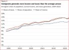
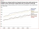
This chart shows the immigrant population having higher income and paying more taxes that the average person (whatever that is), while being a smaller percentage of the population. Makes sense to me, seeing all of the single go-getters with high incomes and no wife or kids to add to their share of the population.
View attachment 237543
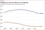
This one shows the immigrants are more likely to be working age, which is consistent with what I've been saying. Naturally, that group pays more taxes.
View attachment 237544
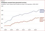
This one makes sense. No kids in public school, no free lunches for them, few collecting SS or medicare. (Theoretically, SS and medicare shouldn't be considered a benefit since the participants paid into them ahead of time, but alas, they're counted as government benefits).
View attachment 237545
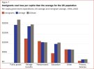
This one makes sense too with the old age and education benefits.
View attachment 237546
This one I have a hard time believing, that the immigrant share of population over 65 is about the same as their overall share of population. I just don't see how that can have happened.
View attachment 237547
Me thinks there's an agenda behind this report.

